

As one might get the idea from my ongoing Alternate Album Cover Art series (click here for the previous article of the type), I love looking at album covers! Despite the excess of these as an overall percentage of my posts on this site, something in recent weeks provoked me into covering more album covers ahead of schedule.
A disturbing trend has emerged for bands to lean towards artificial intelligence (AI) to create album covers in place of hiring someone to create one using their own artistic skills, and this includes a few bands that I enjoy listening to. I understand that there are many graphic tools out there that assist visual artists in creating digital art that could arguably be considered some type of automation or replicating of real-world features, but my philosophy is that it mostly comes down to the time invested in your work. By this, I mean if the majority of the legwork is handled by a person versus some sort of automated process, then your efforts are admirable regardless of the quality. If, as it the case of many publicly-available AI tools, you are simply providing descriptions of what you want the art to be (no matter the level of detail you provide), I see it as pretty much the equivalent of working with a police sketch artist. They are the artist, and you are merely guiding them on what you are looking for. I can think of a concept for a painting, a novel, a movie, or just about anything else, but if I don’t flesh the idea out (i.e. let someone or something else do it), I haven’t really created anything other than an idea. Personally, I’d hand the idea off to an artist and let them go to town on it.
Anyway, I’ve been combing through my collection album-to-album over the years and have built up several dozen potential albums to discuss in the future. Due to the volume to cover, I’m going to up my eighth edition of my Alternate Album Cover Art Series by one more to cover six more artists. That doesn’t sound like much in the grand scheme of things, but I like my posts to have somewhat of a reasonable word count. And to reiterate in the event you think my critiques of certain covers are unjust, even the worst of these that I’ve found over time are acceptable so long as they didn’t hand it off to an AI process to design. I implore you all to support visual artists out there by any means you can.
Now, on with the show!
Meshuggah – Meshuggah EP to Chaosphere
I’m beginning with something of a bonus as this one accounts for a full range of albums. I featured the cover of a 2018 vinyl re-issue of Contradictions Collapse on my Instagram page (which I’ll once again plead for you to check out and follow), but there were a whole bunch of reissues that Nuclear Blast re-released on vinyl alongside it. The first five major releases by Meshuggah were covered by that round of re-pressing, but I’m getting ahead of myself.
Grouping each release together in their original appearance, with the oldest at the top-left and newest at bottom-right, here’s how they made their first visual impression on the world.

The credited artists for each covers are Magnus Åström (None), Stefan Gillblad (Destroy Erase Improve), and the band’s drummer Tomas Haake (Chaosphere). Neither the 1989 self-titled EP or Contradictions Collapse appear to have a visual artist credited in their original liner notes. Of course, it was the ground-breaking music on these recordings that matters to most, but I think the full-lengths of this batch in particular I associate a very strong link to the art being part of their identity. Meshuggah evolved into their own sound while exploring thrash metal, jazz fusion, and progressive rock among their influences, and the experimentation shows in how their chosen visual art style evolved as well. Plus I have a denim vest patch of the Chaosphere album, so I kind of identify the image as an alternative logo of sorts, and I’d think some other fans (and potentially the band) would too.
I’ll admit that I prefer the covers on the full-length albums over the EP covers, though in the case of their self-titled EP (sometimes referred to as Psykisk Testbild) I enjoy the trickery that the pattern plays on my eyes. It mirrors the hypnotism of the tight polyrhythmic playing style that Meshuggah became known for. While that cover and None are more simplistic in design, the initial low print run of the two EPs could be a factor in them not coming off as identifiable as the full-lengths.
And see below for the same recordings in the same order, this time as they appeared in Nuclear Blast’s 2018 vinyl reissues.

The five covers above were all designed by Keerych Luminokaya, who has done artwork for the band since their Koloss album in 2012 . While I was initially unsure what to think of these drastic changes, my brother made a good point to me one day about these reissued album covers. It was something along the lines of “at least it indicates to you that it’s a re-release”. A quick look at an album that was long out-of-print, and you may think that it is an original if the cover remained the same. In some cases, this difference could result in you spending far more on something than what it is worth.
While holding each one of these next to the initial release covers, you can catch several stylistic differences, which is natural considering the artist has his own methods and personality being expressed, though they still appear to align conceptually with the originals. With that, I’ll state that these are simply my own interpretations of the art rather than based off statements by the band or the visual artists. The self-titled EP still has me rubbing my eyes as my gaze is pulled straight into the middle of the image. Contradictions Collapse, rather than showing a bomb detonating on New York City, this looks like it could be a witness to such an explosion. That may be some sort of alien being judging from what appear to be horns on their head, or maybe their facial features are being distorted from the fallout. None also appears to contain a man in anguish (I would be, too, if gagged and goggled like him!), Destroy Erase Improve still shows three figures in different states of restructuring, and Chaosphere preserves the heavily-guarded brain that I’ve come to know and love.
The more I reflect on these, the more I’m on board with them.
Cactus – One Way… Or Another
When my father passed away nearly five years ago, my mother allowed my brother and I to look through his record collection and take some albums that interested us. This gave us an interesting opportunity to ask questions aloud, wondering where he would pick up certain albums, why he would do so, and find those surprises that we did not think he owned.
One Way… Or Another by Cactus was such an album. Heavy rock music was not something we knew him listening to that much aside from having some Black Sabbath and Led Zeppelin, but Cactus was slightly leaning into the obscure side. A Vanilla Fudge spin-off with very much a meat-and-potatoes hard rock sound, while it arguably under-performed commercially by peaking at number 88 on the US Billboard charts, I chose it to perform on my turntable.
The record, as retrieved from my dad’s collection, appears as shown below.
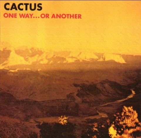
The cover photography was by Alan Azzolino in what appears to be his only music credit, with the design credited to the band. I’m always curious to see what the source photo looks like for covers like this to get an idea whether or not it’s use would have been better or worse. The over-saturation in yellow doesn’t make for the most appetizing image, but it at least makes the band name and title very legible as a backdrop. It also makes the landscape look like it’s being engulfed in flames and the atmosphere seem as if this was taken on Mercury or very near the sun. Not sure how that would explain the river, but I need to brush up on my planetary science.
A variant exists from France, which took a radically different direction.

This one obviously plays into the band’s name, but they already leaned into that on their self-titled debut. People would get the point if you did it once, so perhaps these pointy people are taking the theme beyond what is necessary. I think it’s a cute enough drawing, which was created by Jean-Paul Barthe. This appears to be the most mainstream cover he worked on, with the rest seemingly being French and European artists. I would call this my favourite of the two covers, as I feel this one makes for a superior conversation piece. How did all these needles get spread across the town, and why is the cactus the only thing that doesn’t have any on it? Is this symbolic of the band’s music infecting everything it touches? And what’s with the striped puddles beneath everybody? Were there also spikes on their feet, and those are pieces of floor board that they inadvertently dragged out from their houses?
Feel free to come up with your own theories.
John Lee Hooker – House of the Blues
This John Lee Hooker album’s title spawned a chain of concert venues / restaurants (off by one letter, close enough!) and the musician is recognized for helping to popularize blues music and influencing several of the earlier rock and roll musicians that emerged in the ‘50s and ‘60s. He was a Blues Hall of Fame inaugural inductee, is a member of the Rock and Roll Hall of Fame, and has a star on the Hollywood Walk of Fame in addition to being named one of the top 250 guitarists of all-time by Rolling Stone. Much of the recognition of his impact in music can be traced to what is considered his debut album, which was actually a compilation of material he had recorded throughout the decade.
When House of the Blues first met the public, this cover is what faced them.
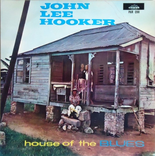
This is exactly what one is apt to picture if visualizing a house of blues. Blues is a working-class music, one created by black musicians, and often practiced by those from a warmer climate in the southern United States (Hooker, like the legendary blues great Robert Johnson, was Mississippi-born), so perhaps a more lived-in abode would make the most sense. If images of sprawling estates like Graceland or Neverland Ranch run through your head when listening to blues music, then I’d wonder what’s going on between your ears. The photo appears to be credited to Don Bronstein, who worked for Playboy magazine and contributed to covers for the likes of Ahmad Jamal, Muddy Waters, and Gene Krupa, but you could swear this was taken straight from a family photo album.
Despite this great mood-setter of a cover, there has been an extraordinary amounts of ways in which the packaging has been re-imagined. One such version came out in the United Kingdom in 1966 on Marble Arch Records.

I fully understand the desire to put the titular musician on the cover of their own album, but could you at least make it so that we can identify the musician in question? I was more convinced of the existence of aliens after watching Plan 9 From Outer Space than I am convinced that John Lee Hooker is in this photo. It’s not the most eye-catching of colour palettes used either. Coming from what looks to be a label that largely released compilation albums on the cheap, I did a quick scroll through their catalog, and this may be the most bland and unmemorable cover of the lot.
Under a new title, The Chess Story (Vol. 2), 1973 brought us another cover variation, this time from Sweden.
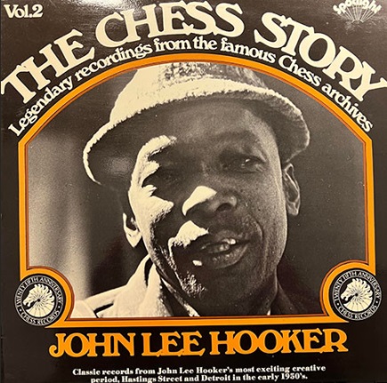
The photo is a definite improvement on the previous sample despite the re-brand, though I suppose re-naming a compilation album (of all things) isn’t exactly one of the seven deadly sins. I also like the use of font and border here. However, I would say that this makes the album appear even older than it is, like it was from the 1930s or even earlier. I’ve got a book about Laurel and Hardy that makes use of similar framing and design on its cover, so it reminds me of old cinema signage.
There are likely several variations out there that I’m not even touching on, but to power through a few more, here’s what looks to be a pair of discount versions.
A 1995 Spain release of the album:
And an Italian version from 2004 that was re-titled Down Home Blues:

If I spotted either of those two albums in a CD rack, I’d likely flip past them without pause. There doesn’t appear to have been much effort at all in putting together something with curb appeal in either case. I’d assume neither release would have bothered to credit any graphic designer or photographer. While they appear to be dollar store material, at least it would be a good price for the music.
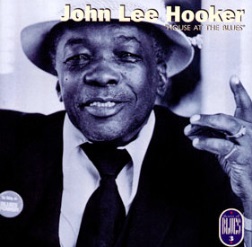
Finally, Chess released the following version in Sweden in a series called Chess Masters at some stage in the early-’80s.

Promoted to Volume One of this reissue series, which also included (among others) similar Buddy Guy, Sonny Boy Williamson, and Bo Diddley editions, this one I’d say has the most interesting of the photos that feature Mr. Hooker. It’s a surprisingly high-resolution of a photograph, and his eyes are catching his name, admiring it with pride as if broadcast above the entrance of a prestigious concert venue.
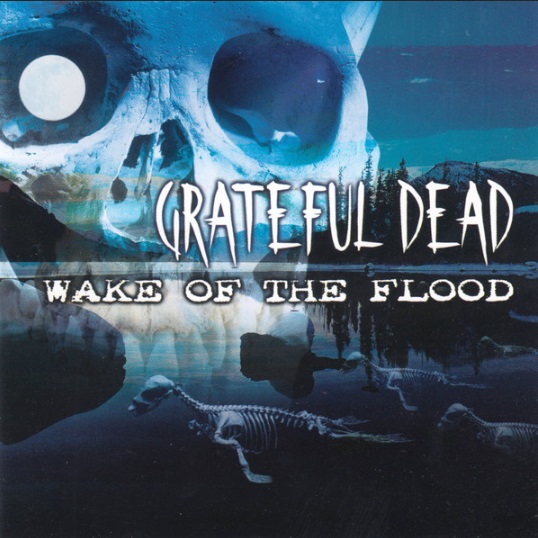
Grateful Dead – Wake of the Flood
At this stage in my life, Wake of the Flood is the only Grateful Dead album I actually own. I’m not quite sure why that is. I took a wild stab at this and figured I’d enjoy this one when I laid my eyes on it at the nearby branch of Kops Records. Out of interest, years later I saw the Grateful Dead tribute band Jazz Is Dead (featuring ex-Weather Report bassist Alphonso Johnson) cover this album among other Dead tracks, so I did eventually learn that this album has something of a legacy. However, my guess-timation at the time as to why this was a good one to buy was a combination between the year it was initially released (1973) and, yes, I also judged the album by the cover. Sue me!
Feast your eyes on this baby, and try telling me I was wrong.

As I decided to feature this album, I decided (after far too long a delay) to see if I had any other covers in my collection created by Rick Griffin, who is responsible for multiple Grateful Dead designs. Unfortunately, I don’t think I do, but he’s contributed some fascinating designs for an assortment including Mad River, Quicksilver Messenger Service, and The Neutrons. The artist, who died in a motorcycle accident in 1991, once told ZigZag magazine that inspiration for the cover came from The Holy Bible’s book of Revelation, using a warm and positive image as a contrast to the verse “And the sea gave up the dead that were in it and death and Hell gave up the dead that were in them, and they were judged, every man according to their works” (Revelation 20:13). I don’t display record covers on my apartment walls, but one like this would make a very strong candidate if I did. Hell, this thing could be part of a mural on a church’s wall if they were open-minded enough!
Thankfully, the vast majority of this album’s reissues have the Griffin artwork. Still, I was somewhat surprised that there was an outlier that came from Germany in 2001 courtesy of Falcon Neue Medien.
At first glance, my instinct was those Halloween sound effects CDs. On closer inspection, I see the concept behind the album cover carries through here, with remains of what appear to be whales or some sort of prehistoric mammals floating. Their decomposition is definitely a wake of something, be it a flood, pollution, or simply aging. That said, I’ll say no thanks to this one. It looks like something an up-and-coming band would have used at the time when computer graphic design started to become more accessible for use on home computers. If a local metal scene wanted to release a compilation in support of an environmental cause, this is the sort of thing I could see being slapped on the front as a cost-cutting measure so more of the proceeds can be forwarded to a charity. The skull in the sky seems like it was placed there to fill out space, but the band had made heavy use of skeletal humans on a variety of their designs, many of which live in infamy on a variety of merchandise. Regardless, Ol’ Moon-Eye here won’t be in any danger of being confused for the cool characters on the covers of Blues For Allah and Steal Your Face.
While looking into the record label, it appears that Falcon Neue Medien had a reputation for releasing unauthorized bootlegs of DVDs. That’s why I can’t say for certain if this Wake of the Flood is legit or not. However, Discogs usually blocks bootleg sales, and this version of Wake of the Flood can still be purchased there as of my writing this piece along with other offerings from the now-defunct label. Many unofficial releases and bootlegs just keep the original covers as means of passing something off as legitimate. Acquiring the art may have been one step beyond what this company was willing to fork out for rights to the album, so they settled for someone else’s presumably cheaper labour.
Joe Pass – Intercontinental
As is the case with Wake of the Flood, Intercontinental is the only Joe Pass album I currently own. There’s no particular reason for it. I like the album, and am very much open to getting others.
My version, and most other releases of the album, look very similar to the image below.

This photo is credited to Hubertus Mall, who has several photography credits on Oscar Peterson releases among a few dozen other recordings. Interestingly, he used a similar blurring in his photography for Bora Rokovic’s Ultra Native cover from what looks like the opposite perspective of this photo, a musician looking out towards the audience rather than the other way around. Not one of my favourite album covers, to be honest. I don’t mind the lack of focus on the guitar, but I think it would have worked better if the photo captured one of Joe Pass’ more recognizable guitars (such as a Gibson ES-175). I’m not ever certain if it is one of Joe’s guitars. If it is one of his guitars, and I realize how much of a nit-pick this is, I’d turn it in the orientation in which he played it since Joe was not a left-handed guitarist. It’s a possibility that this photo was plucked from the photographer’s portfolio rather that customized.
A 2014 series of reissues from German label MPS titled Kultur Spiegel (translating to Culture Mirror in English) covered a range of jazz albums such as the Billy Taylor Trio’s Sleeping Bee, Remembrance by the Elvin Jones Jazz Machine, and The Hank Jones Trio’s Have You Met This Jones? Among the batch was an Intercontinental with a matching face-lift.

Each of those changes in the re-issue series are debatable and worth discussing, but in the case of Intercontinental specifically, I actually like how it turned out. There’s something about the colours and the blur on the original that are unsettling to me. Not quite to the effect of something like the psychedelic aesthetics of No Mystery by Return to Forever, but I get something of a queasy feeling from it. For some odd reason, the stage lights hitting the guitar having only yellow hues doesn’t have the same effect on me. The elements of the original photo are still there, but some editing, cropping, and a change in fonts doesn’t really take away from it. The colour difference between the artist’s name and title also aids the cover, as you could interpret the original as being titled Intercontinental Joe Pass. To its credit, though, some editions of the original featured the use of dashed or curly lines next to Joe’s name to break the phrase up, giving die-hard Pass fans some more subtle variances to pursue.
King Diamond – The Spider’s Lullaby
After putting his solo band on hold for a fruitful reunion with Mercyful Fate, a time during which band mainstay Andy LaRocque laid down some memorable guitar solos as a session musician on Death’s Individual Thought Patterns, King Diamond’s eponymous band was back in business in 1995 when they released The Spider’s Lullaby. I appreciate that this album, instead of running with a full album concept, went with the Fatal Portrait formula and mostly featured standalone songs with a brief story linking just a portion of the songs. Many good songs can be found on this one from a new, mostly-American lineup and on a new record label, Metal Blade. Overlooked, I feel, much like many other of his post-Roadrunner Records albums.
When it hit the shelves on June 6th of 1995, this was the album cover.

This cover art was the work of Brain J Ames, an artist that worked mostly on other Metal Blade albums in a design and layout capacity, working on albums by the likes of Immolation, Cryptic Slaughter, and Sacred Reich. I can appreciate this relatively minimal cover. At a quick glance, the spider looks convincingly life-like, and the contrasting white spotlight works well to draw focus on the web. I couldn’t tell you off-hand how accurate the webbing is not being a spider expert, and I couldn’t even tell you what sort of spider it’s supposed to be. A five-year gap between albums would make your mouth water simply seeing that logo back on a new recording, and this serves as a solid teaser for the story that spreads across its final four tracks.
Picture disc editions of the album would feature King’s logo in red, but doesn’t really warrant a great deal of discussion. The more notable stylistic change to The Spider’s Lullaby’s cover was when it was remastered and re-issued in digipak form in 2009, as shown below.

Once again, Brian J Ames was back to give the cover a second crack. I’ll take it that there were certain parameters put in place for this redesign in that it had to be recognizable as the same album. Some of the more subtle differences between the two covers is the addition of shadow being cast by the web and that the web does not connect at all to the logo. I appreciate the spider being larger, but I think I still prefer the more realistic one in Ames’ original version. The size difference is understandable in order to squeeze King’s face on top of it. I could do without the facial imprint, if I’m honest. I once stated on Twitter/X (another shameless social media plug!) something along the lines that no matter my opinion on this cover, the spider at least has great taste in tattoos. Still, I wouldn’t get one myself despite being a big fan of his, especially one that covers half of my body! I’d hate to startle King Diamond in an Alan Partridge-like scenario should I ever catch him in concert again and throw in for the VIP package.
If you want to see a potential deviation for what could have been an alternate cover, there was a bootleg recording of just some select demo songs from The Spider’s Lullaby that I think would also have made for a great cover, possibly preferable to both had it been more polished, but I cannot count it as one of the alternates. It’s a shame because from the beginning of his career, King Diamond has consistently released good music, but doesn’t often have artwork to match. I would say that he’s an artist that (to date) hasn’t had an album cover become truly iconic since Them (though I was always impressed by Kristian Wåhlin’s art on Voodoo). However, I’ve got high hopes in the overall package for The Institute, and feel the wait will have been worth it.
