

While I consider myself an album collector, it’s a rare case that I purchase multiple copies of the same album. I’ll usually grab the first copy of the album I can get my hands on, but this doesn’t always go so well. When an album has been out for several years, it will often get reissued if there is still a demand for it. This could be for a plethora of additional reasons, such as another record label acquiring the distribution rights, the launch of the album was done so on a small print run, an expanded version of an album is released to commemorate some sort of anniversary, or it underwent either a remastering or full-blown re-mix. On many occasions, this results in the album cover undergoing a transformation.
Changing an album’s artwork is somewhat controversial. Sometimes there is a valid reason for doing so, and other times it is more questionable. There are several examples of this that I can point to within my collection alone, so I’ll focus on five of these at a time, and discuss other covers in future posts. Additionally, since this is a music blog, I’ll include some links in the title of each section where you can sample a song off each album even though I won’t dwell much on the music itself.
Bill Evans and Jim Hall – Undercurrent

This cover leaves quite an impression on me. It’s very fitting of the title, though it seems a bit unsettling for what I’d associate with a jazz record. It wouldn’t look out of place as an image that a gothic rock or depressive shoegaze band could use. There’s no certainty that the woman in the photo is dead with her face being above the surface, but this still image comes off as strikingly dark. It really makes the user question how the woman got to the state she is in.
The photo was taken by photographer Toni Frissell in 1947 and is titled “Weeki Wackee, Florida”. The image has been licensed for use on not just Undercurrent, but other album covers as well. That’s the only troubling thing I’d have if I were to ever release an album of my own. I’d probably prefer to use a piece of art that is exclusive to my album sleeve, but still, if you find the right image, why not use it regardless? As Undercurrent is usually considered a highly-regarded recording by jazz aficionados, this has likely stood as the most famous appearance of the photo.
The album has been re-released with slights variants to the above. Sometimes the image is a brighter shade of blue or green, sometimes there is text on the front, etc. Here’s an edition of the album that I own.

No, I wasn’t testing out my Crayolas. Those scribbles are a legit design choice. Is there any significance to it? The use of an artist photo is not at all surprising to use on a rerelease. It’s just unfortunate that they couldn’t find a suitable photo of Bill Evans and Jim Hall together, with a smaller pic of Hall being relegated to the back.
It’s labelled as being part of The Douglas Collection, who released a bunch of these in 1972. It appears that there were many big jazz names (with Kenny Dorham, Charles Mingus, Billie Holiday among them) who couldn’t escape the stroke of Harold and his purple crayon. Or his red, his yellow, his green…
Korn – Issues
I have owned Issues twice. The first time, I received it as a Christmas present, which was the original album cover.
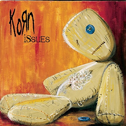
As far as I know, this is the version you can still find readily available in your local music store. I even had a shirt with this cover art on it when I was in high school, which had the text “I have Issues” printed on it, allowing me to perpetuate an image of being a disturbed adolescence to a group of peers who were (hopefully) not buying it. Anyway, this image was the grand prize winner from a contest run through MTV. That sounds like a very corporate-sounding endeavor for a band to partake in, but the platform does allow for them to cast a wider net in hopes of finding a great artist.
Here’s a scan I took from the liner notes of Issues, which shows three other finalists for the contest.

When I was in high school (my peak Korn listening days), I preferred the cover with the cartoon depictions of each member of the band. Like each of the other finalists, I think the image was a bit too busy. The contest winner, while still a great painting, allows for some space in the top-left corner to stick the name an album title. According to Wikipedia, they ranked in the contest from 1st to 4th going clockwise starting from the top-left.
Here’s a closer look at the cover from my second (and current) copy of Issues.

It’s difficult to make out what is going on here. I see a photograph with two people on it, with a few candles surrounding the frame. I assume it is representing a memorial for two people that died, with the chalk drawings possibly acting like chalk outlines in a crime scene. It doesn’t pop off the shelf like the doll cover does, and I can see why it didn’t rank higher than the other three.
I’m curious as to whether or not the entrants to the contest were told in advanced the title of the album, or if it was a matter of submitting art with no descriptive attached. Also, are any cover versions more scarce than the others? I’m sure there’s a re-seller or two that may charge a premium price for the less common images, but considering how popular Korn were in the late-90s to early-2000s, each version probably had at least 100,000 printed.
Deftones – White Pony
Just a year after Korn threw a multitude of album covers into the marketplace, Deftones, another band the press frequently dubbed as “nu-metal”, did something similar. This time, in my opinion, the variations are nothing to write home about. First, we have the original cover.

This is the version I used to own. It’s a simple design, but effective, with the grey colour serving as a good contrast to the white pony. I’ll have to describe this as another one of those covers that gives no hint as to what style of music you are dealing with. The minimalism and diagonal lettering in a sans serif font makes me think more of an electronic or dance album. As this is the first album featuring turntables / synthesizer player Frank Delgado on board as a permanent band member, it seems like a suitable time to make this shift in art direction, but it’s likely just a coincidence. They’ve done a decent job over the years since then of varying their cover designs, which seem to have all been handled by Frank Maddocks.
When comparing each White Pony cover side-by-side, there really isn’t much to complain about. They all have the pony, so your preference can pretty much come down to what your favourite dominant colour is or the placement and size of said pony. The copy you are likely to find in stores today is the white cover.

The pony now takes centre stage, with a black border now necessary to distinguish this from that other white cover by that obscure band whose name escapes me. I’m not sure why this cover became the version that most editions are now printed on. Did the band prefer this version? Was is record label meddling? It turns out other versions exist with a few tweaks. Here’s a red version, which came out as a limited edition around the same time as the original grey cover.

The limited edition also came in black, but as it featured the same layout as the red (which shows the track numbers and run times), I won’t waste the page space showing it. The thing that bothers me with these variants of the White Pony releases is the actual music content. The initial gray cover version had eleven tracks. The red cover version had a twelfth bonus song “The Boy’s Republic” tagged onto the end. The white version also has twelve tracks, but added the extra song “Back to School (Mini Maggit)” at the beginning of the album.
My impression of this type of thing is that it’s more of a cash grab than anything else. At the time, you didn’t really have the option of jumping on iTunes to buy these extra songs. At least it was around the time that Napster emerged, so I wouldn’t fault someone owning the grey cover at the time for stealing the other two songs. The label should know better than force the public to buy two extra albums to get the two bonus tracks. Singer Chino Moreno was allegedly displeased with this tactic, and I’m sure his band mates would back him up on that. I know I was certainly unhappy when I got my grey version when I was a teenager with little money to speak of.
Mahavishnu Orchestra – Between Nothingness & Eternity
Let’s start off with the original cover. Yes, I know compact discs didn’t exist in 1973, but it’s practically identical to the vinyl cover of the time.

The image may seem a bit generic in retrospect. The similarly-minded progressive rock band King Crimson had an album (Islands) with a comparable cover. However, the vastness of space is a concept with very wide appeal. From the fifties through to present day, show me one genre of music that hasn’t had a single artist getting caught up in the space race, Martian madness, or expressing similar interplanetary interests. Even Santa Claus got in on the action! The guy had enough trouble making sure I got the right Ghostbusters action figure, yet he expands his operation to Mars…
I’m guilty of getting lost in images like this every now and then. Even when looking at images of earth, be it maps or aerial photos, the thought of how small humanity is in the grand scheme of things always made my head spin. Galaxy-spanning shots like the above sets a good tone for a jazz fusion band who themselves try to stretch out as musicians to create other worldly sounds, so I definitely buy into their cover concept.
Between Nothingness & Eternity has been released with variants on the above image such as colour changes, but also with few other radical transformations. Here’s what my copy of the album looks like.

Leave it to my home and native land of Canada to try to be different. It appears that this version was oddly exclusive to Canada. What? Was Buffy Sainte-Marie thinking of using the image for her own album, and they wanted to avoid confusion? Vinyl enthusiasts will delight in the fact hat this version has gatefold packaging. Puzzling enough, the original album art can be found on the inside along with a poem excerpt from guru Sri Chinmoy’s “The Flute”. Couldn’t they have placed this art on the inside instead?
It makes sense to show the band on stage for a live album cover, but I don’t think it should be mandatory. As long as ‘live’ is listed in the title, you don’t need the picture to drive the point home. Besides, there are plenty of live albums that feature a picture of the artist(s) on stage whose legitimacy has been put into question (cough Unleashed In The East cough). I’d like to know if the photo is taken from the shows from which this live album was captured (August 17-18, 1973 at the Schaefer Music Festival in Central Park, New York). The skyline shown above the band looks like it could be New York, which would certainly be appropriate.
I’m not deeply against the cover I have, but I’d rather be among the stars.
Megadeth – Killing Is My Business… and Business Is Good!
I’ll shake this one up by showing the reissued cover first. If you’ve recently ate, try not to scroll too far down past this one.

By all accounts, this represents what was the artwork was originally intended to look like. Somewhere along the line, let’s just say that the wires got crossed to put it lightly.
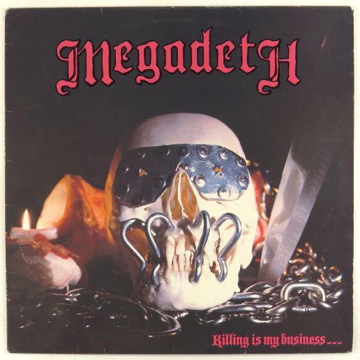
It’s sad to think that this was most of the world’s introduction to Megadeth’s iconic Vic Rattlehead mascot. Heck, even Ronald McDonald got messed up royally the first time out. Coincidentally, Dave Mustaine has described this eyesore along the lines of being a skull with ketchup for blood and pickles on it.
The record label didn’t follow Mustaine’s original sketch concept very well. They got the skull, covered the eyes, and surrounded it with whatever could be found in the discount bin of the local hardware store. It’s also bizarre seeing Megadeth written in that lettering, as well as seeing the album title not being listed with each word starting with capitals.
The album design is credited to Donald J. Munz, with a photography credit to Dan Rizzi. Are they to share the blame? I can’t find much information about Rizzi, but Munz seemed to be one of the go-to art guys of independent label Combat Records. The label’s stable of artists evidently had a bit of a skull obsession, seeing as they were depicted on Combat-branded recordings by the likes of Savatage, Devastation, Forbidden, D.B.C., The Exploited, Death, Nuclear Assault, Possessed, Trouble, and Oz, to give you a good enough sampling of the 80s underground. Sure, some say the skulls are just a metal thing, but it’s not as if every disco album cover had a mirrored ball, every rap album had a mugshot, or every modern country album has a “Best Listened to at Barely Audible Volumes” sticker (my humble suggestion). Think outside the box!
How they butchered this cover the way they did is baffling. Mustaine even gave them his own drawings to work off of, and from the look of it, they could have simply taken a picture of that and walked away victorious. While he didn’t do the painting, Munz was responsible for the art direction of Exodus’ legendary Bonded By Blood, so you would have thought he would have shown more enthusiasm over tackling such an interesting concept.
The reissued version is truly a cover being remade properly. It’s a shame they had to censor their colourful rendition of Nancy Sinatra’s “These Boots” to somewhat tarnish the repackaging.

5 thoughts on “Alternate Album Cover Art”