

They stopped numbering Star Trek movies after the sixth one, so if I’m to continue this series I’ll need a new franchise to pay homage to in my titles. What goes beyond six movies, though? The Fast and the Furious series? I love action movies, but I’ve never been won over by Vin Diesel. I’ll need to execute some creativity, for once, in my next installment, but no need to get ahead of myself…
If you’ve read any of my previous Cover Art posts, first of all, thank you! Second of all, feel free to peruse my prior explorations (Parts I, II, III, IV, and V). This is my sixth go at this series, so here comes five more examples of some covers that have changed throughout the years.
Phil Collins – Face Value
I’ll lead, for once, with an album I don’t have in my collection. Not that I find anything particularly wrong with Phil Collins’ solo material as I’m fond of at least a few songs he’s released over the years, but it doesn’t strike me the way his work with Genesis does or even in contrast to the solo work of Genesis’ first lead vocalist, Peter Gabriel. Nonetheless, I found what was done with the re-issue of several of Phil Collins’ albums to be rather interesting.
Let’s focus primarily on his first solo album, Face Value. Here’s how it appeared when it reached stores in 1981.

I didn’t even know the history of this cover before deciding to examine it, but am well aware with “take me at face value” as an expression. In the context of Phil Collins, you could view it as him having stepped out of what was considered to be a rather conceptual and theatrical band, and coming out with something more stripped-down. Though he didn’t actually leave Genesis and would run the solo career in parallel with them, all the pressure and potential praise or criticism of his own material would be his and his alone. In that regard, I can’t blame him for keeping it simple, and showing the world the man who’s responsible. The photo was taken by Trevor Key, whose also paired memorable imagery to albums such as Mike Oldfield’s Tubular Bells, Peter Gabriel’s So, and New Order’s Technique.
In 2016, you could say the album got a face-lift, though I don’t believe Phil personally underwent such a procedure himself. The man’s a natural!
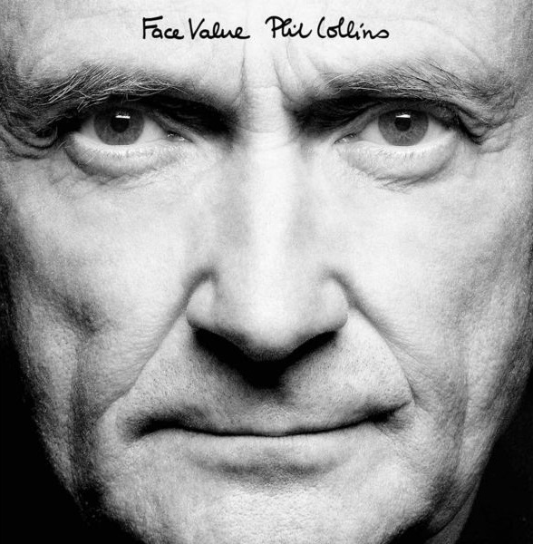
It would have been a nice touch if Trevor Key was available to take the modern photography, but he unfortunately passed away in 1995. These updated shots were taken by Patrick Balls. “Paddy Balls” has enjoyed a recent affiliation with not only Collins, but also with Genesis and Genesis-affiliated Mike and the Mechanics alongside other artists for which he has handled various photography duties.
While you see the face, you don’t see his hairline, so you don’t see all the impact that over three decades have done. Of course, you could just refer to your preferred internet search engine, and you could probably find pictures of him from virtually any year of his life or from any month of his recording career to see the many looks of Phil’s hair. I didn’t think of it until recently, but his only album cover where you do see his hairline (from when he had one) is No Jacket Required, unless you want to count his Going Back covers album that has a photo of him as a boy. I could have sworn that you could see his entire head on the …But Seriously cover, but since it’s just his face, I never think to glance at it.
You may also want to seek out the entire re-release collection if you want to see more angles of a 65-year old Phil Collins (or, more importantly, if you like his music)It may also be of interest that he also replicated the back cover to show how the years thinned his hair out. In reality, the inclusion of the face and back of his head come about so that the listener of the enclosed record could get, as Collins states in the Classic Albums special for Face Value, “inside my head”.

I typically like re-issues to maintain the original cover, but this remains faithful to the concept, and at least signals to the consumer that this is a different edition of the album. That said, I was thrown for a loop when I first saw the new edition of Face Value on shelves because I didn’t remember Phil Collins looking that aged when he was only 30. To borrow an old cliché, I thought I’d stepped into the Twilight Zone!
Scorpions – Taken By Force
Taken By Force was the first Scorpions album I developed a familiarity with it, coming from my brother’s collection (I’ve since got my own copy through the band’s Original Album Classics three-pack). I’m not sure why he purchased the album, but I can recall that Scott Ian from Anthrax mentioned in a Guitar World magazine that he was obsessed with the intro to the song “Sails of Charon” when he was growing up. That may have been what sparked my brother’s curiousity because it definitely sparked mine.
Here’s what initial copies of the album cover looked like.
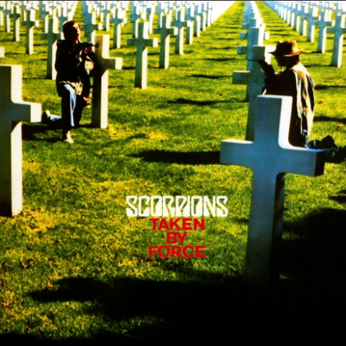
The thing I find unusual about this change is that this original was deemed offensive for a different reason than a Scorpions cover is usually deemed offensive. You have the infamous Virgin Killer album, with depicted a ten-year old girl posed naked with a shattered glass covering her genitalia (which I will not link to for obvious reasons), and a string of other albums including Lovedrive, Animal Magnetism, and Love At First Sting that each caused a stir over heavily-suggestive sexual artwork. And it just occurred to me that an even earlier album (In Trance) had to have a woman’s breast darkened in shadows as well.
Most descriptions as to why the Taken By Force cover was deemed controversial I’ve come across seem far too vague, but the root of it this time definitely stems from what looks to be two people aiming guns at each other at a cemetery. However, singer Klaus Meine states in a 2015 interview at the time of the band’s 50th Anniversary Deluxe Edition re-issues that it was likely the band’s reputation that had placed their work under heavy scrutiny. The original cover serves as a predecessor to covers like Metallica’s Master of Puppets when it comes to pairing the title to the imagery (though Metallica’s can be seen as a cross between both “Disposable Heroes” and the title track). Both show the connection of war with death, and in the case of Taken By Force, implies that many nations have assembled their armies by conscription and that war casualties are inevitable.
Surprisingly, they went back to the same pair credited for the Virgin Killer mess (Michael von Gimbut and Steffan Böhle). Their respective bodies of work contains plenty of overlap, largely within the German music scene with some exceptions. In their defense, it may not be the greatest staging of the concept, but this time they had the right idea. Consider this as somewhat of a redemption story for them since history has been much kinder to it.
Some markets had the cemetery scene, while others would have the following.

This is the cover that I’m much more used to seeing, and it’s one of the most slapdash I’ve ever seen. I understand when you are running low on options that the easiest and safest option is to throw a picture of the band on there, but the way it’s done here is quite bizarre. The multiple uses of the Scorpions lettering in the top banner, the title crammed into the center, and pictures of the band members in between them don’t stand out positively. And how about all that wasted black space on the other half of the album? I get that they may not have wanted to clutter the cover too much, but they did just that on the upper portion already. Space it out, man! SPACE IT OUT!!
They are all posed differently here with seemingly no thought given. You couldn’t get a picture of Uli Roth where he doesn’t have his fingers in his mouth? And why do each of them need to be named on the cover? Save that sort of thing for the inner jacket! Herman and Francis (thank you, labels!) in particular look like they have run out of patience already with what had been the second major change in an album cover they’ve had to go through in their career (I’m not counting In Trance towards that tally). I’m sure they were counting their lucky stars for the first one’s getting changed (Virgin Killer), and given the title of this album, would dread to think what could have happened if they let another visual artist run with it. I’m certain most could imagine much darker themes that could fit the “taken by force” phrase, and given their cover track record, I’m half-surprised it didn’t take that turn.
Based on how they are dressed, the individual pics were taken from the same photo session as the group shot that appears on the back cover of certain versions that had the original cover. Why didn’t they just go with that? Too similar to the second Virgin Killer cover, I guess. Why not make it entirely black, with just their name and title? That could have served the anti-war message nicely too.
Kate Bush – The Kick Inside
The Wikipedia entry for the album mentions that six different variations of this cover exist, though Discogs points out a seventh. The Kick Inside is Bush’s debut album, the one that launched such a fruitful, creative outpouring, so with the sheer amount of times the album was released and markets that Kate Bush’s music spread to you would expect the odd variation.
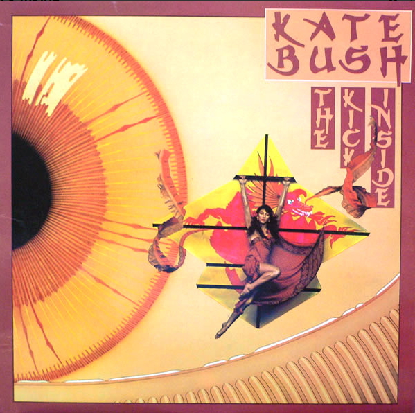
This original cover effectively blends a few different themes scattered throughout the album. Not only do we see her strapped to a kite (“Kite”), but a giant eye is prominent in the background “The Man With the Child in His Eyes”. I still consider myself to be a relative newcomer to Kate Bush, so there may be additional details or “Easter eggs” in the album’s art I’m not catching. The kite, her costume, as well as choice of lettering, give the cover a Japanese feeling. Whether you consider this sort of thing to be cultural appropriation or not (or whatever you may think of that term), I’ll say this one is a memorable visual.
My first instinct was that it might have been the work of the designer of Talk Talk’s interesting covers (James Marsh) due to his frequent focus on eyes and faces, but I was mistaken. The front cover of The Kick Inside was created by Splash Studios, who only seem to have five other album cover credits including Gong’s Expresso II and RAH Band’s The Crunch & Beyond, with the concept for front and back covers being shared with Kate, her brother John Carder Bush, and her frequent bassist and long-term partner Del Palmer. Parts of it look a bit dated stylistically (something about the way the bottom eyelid looks), but it no doubt seems to have some considerable effort and thoughtfulness behind it. I appreciate the inclusion of detail like that white film that develops on the edge of the eyelid, whatever you call that stuff.
Maybe there were issues with the artist wanting further compensation for the image to be produced in other markets, and thankfully it remains the most common of The Kick Inside covers over the past fourty-four years, but we’ve got the others to review. Since they are all relatively standard photographs of Kate, I’ll cram them all into one image.
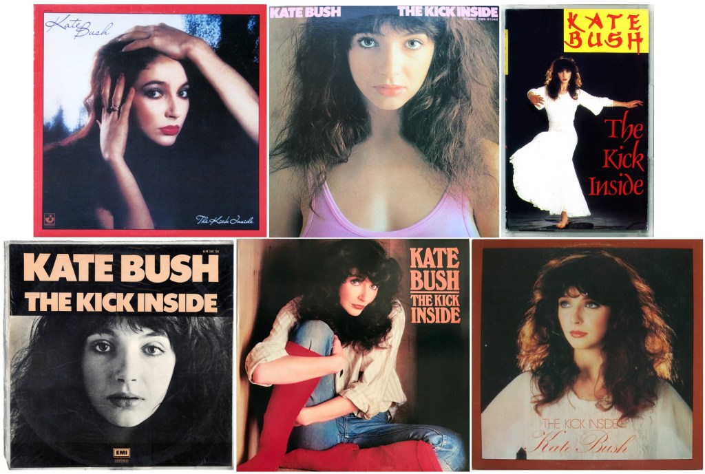
The US variant at least shows Kate in what appears to be a box, so at least she is “inside” of something, and the cassette cover from a 1988 Sweden release shows her dancing, or arguably kicking with grace. My least favourite would have to be the Uruguay version on the bottom-left. Like the Japanese cover (top-centre), they went with fairly uninteresting photos of her where she’s facing the camera head-on. They even translated the song titles to Spanish, which is interesting. However, I don’t know if they bothered in translating the lyrics since an image wasn’t uploaded to Discogs along with it. The version in the top-left matches the one in my collection, which made an appearance in my native Canada. I think the image of Kate in the Yugoslavia edition (bottom-right) captures her quite well. I actually like the fact she’s looking off-camera here, and the lighting highlights in her hair make her stand out well from the dark backdrop. Still, I’d even consider the best of these ones as more suited for a greatest hits album.
Roland Kirk – We Free Kings
Much like with pop albums, I know that changing album covers in the jazz world seems to be what I consider to be a problem. The philosophy must be that the public couldn’t care less as to what photo of an artist you include on it so long as they are on it. They seem to look past the value that art direction has on making even a photograph-driven cover stand out.
Take, for example, the original Mercury pressing of Roland Kirk’s We Free Kings.

Thankfully, most versions of this album appear as above. It’s often hard to pinpoint exactly makes a great jazz cover. There are exceptions to the rule of including a picture of the bandleader on the album cover, with perhaps the works of Mati Klarwein being among the most iconic of that category, but if you do use photography it still needs considerable consideration behind how it gets utilized. This original version makes great, non-overwhelming choices with colour and fonts. It’s a nice choice of photograph showing Kirk in calm action in spite of the great responsibility of managing each instrument in front of him, capturing visually how he can play in harmony with himself, and the crown over the ‘k’ and ‘i’ is a nice touch.
Rahsaan Roland Kirk, who became blind at age two due in part to damage caused by eye medication, obviously could not be consulted with the cover to the degree someone with full vision can. These alternatives I’ve learned about seem to have come from only a few years prior to his death in 1977, but it’s possible that word would have come around to him that they weren’t necessarily up to the standard of the music. And in case you’d like to see where his standards were at, I’d recommend watching the documentary The Case of the Three-Sided Dream to gain a glimpse into his life and his art.
White text on yellow background is never a crowd-pleaser, which this 1976 Fontana reissue from Italy has in spades.

It also came out in Netherlands, which can be seen here. The text can be read more easily there, but I think the faded one above best exemplifies my frustration with covers of this sort. You are at the mercy of time, storage and manufacturing quality control as to whether your copy is legible. All the ring-wear in the world wouldn’t make it much worse to look at either. I’m not the biggest fan of the use of a sketch-rendered photo here, but red works better with the yellow than most of the use of white does. Would the essay’s text have been better served if it was red? Possibly. As a positive, I do like that you get to see the entire scale of his instruments as they sit on his body.
Here’s another Fontana issue of the album from an unknown country of origin.

I’ve got to say that this one has taken some more thought, or is at least easier on the eyes. A royal crown of arms framing his name connects well with the title. The photo choice isn’t horrible, but the black and white of it in combination with the close-up crop makes it difficult to distinguish between each of his arsenal of wind instruments. In total, there still isn’t much going for it to keep someone from skimming past it in a record bin.
My copy, which I found at one of my favourite stores in Toronto (BMV Books) roughly three years ago, was from the Trip Jazz label.

If I’m to judge by the similarly designed covers that label had to offer, I’d estimate this one to be from 1974 or 1975. Many of the other covers in the Trip Jazz Special Collectors Series did use the original albums’ artwork, though in a shrunken form surrounded by the typeface. I can sort of understand why they didn’t do that with We Free Kings considering more than one-third of it was white, and including the album title twice may be redundant. The colour choice isn’t terrible as I can appreciate greyscale covers in certain cases, but in contrast to others from the series, it seems like the colour was removed to penny-pinch more than it was a stylistic decision. He wasn’t alone in this treatment, but it appears others that I would have the same complaints about (grey and without original artwork) are albums that also got re-titled. For example, this copy of Clifford Brown and Max Roach’s Jordu is actually the same as the duo’s 1954 self-titled release.
All in all, I’d still consider the Trip Jazz edition to be the second-best of the We Free Kings covers.
Iron Maiden – No Prayer For The Dying
Here’s a variant I never knew existed until some point last year. I no longer have a copy of No Prayer For The Dying in my collection, but my trusty brother ended up finding a cassette copy at some point last year, which I happily revisited because in spite of what I consider to be a fairly mediocre and inconsistent album by their standards, Derek Rigg’s Eddie illustrations are always a feast for the eyes.
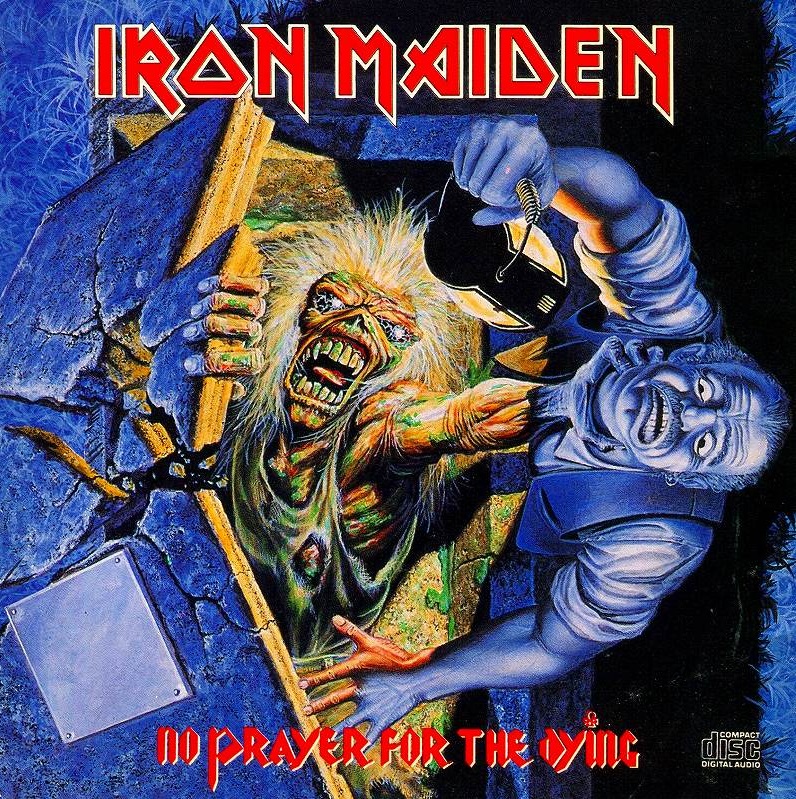
Take that, unsuspecting night watchman! Eddie has you by the throat, and there’s nothing you can do about it! It may lack some of the imagination that his Maiden covers from the ‘80s displayed, but this is still a very appreciated contribution to the Eddie lore. It goes along with what the band were doing musically. They were abandoning much of the overly synth-soaked and prog-tinged efforts of their prior two albums and went with a more stripped-down and raw sound more in line with earlier works such as Killers. Eddie was literally killing it (whomever it was) back on that 1981 cover, and he showed 9 years later that old habits die hard.
When the album was remastered and repackaged in 1998 as a 2-CD set (the second disc containing B-side cover songs ranging from Led Zeppelin’s “Communication Breakdown” to lesser-known Stray’s “All In Your Mind”), the cover looked notably different.
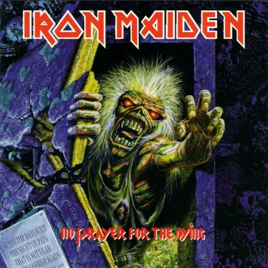
The main changes that stand out immediately are that the painting is cropped so Eddie appear much larger, and his hand simply reaches out to the sky rather than around that guy’s neck. Just Eddie emerging from the tomb, much like the proverbial zombie does to fulfill his or her craving for brains. As far as why the man was removed, the story goes that Maiden’s manager Rod Smallwood thought the lantern-holding man looked a bit too much like him, which may have triggered the change. As far as I can tell, this may only be a rumour. Another aspect I only recently noticed was Eddie’s eyes. Originally, they appear saturated with white light and have a bit of a lightning pattern radiating through them. For some reason, the eyes have been changed to a glowing red. This might have been due to wanting some colour variance that the original lacked, which I can understand.
I have to say that I like impact of the lantern shining on the face of Eddie in the original image. It encapsulates the feeling you have when someone switches the lights on in a I have to say that I like impact of the lantern shining on the face of Eddie in the original image. It encapsulates the feeling you have when someone switches the lights on in a room unexpectedly, such as when you are in the midst of a nap, or even when you go to empty your bladder for some 3 AM relief without bracing yourself for the intense brightness of the bathroom lighting. For all we know, that hand could have been reaching up to snatch that source of light, but Eddie inadvertently lunged at the jugular in a moment of temporarily impaired vision. We don’t even know what this man was doing above the tomb. Maybe he works for the funeral home, and was removing the name plate to add some much-needed detail.
That’s the main perk of the alternate cover here. A phrase was added to the plate that reads as:
“ After The Daylight
The Night Of Pain
That Is Not Dead
Which Can Rise Again”
Don’t these people know Eddie by now? He already emerged from his supposed resting place on the Live After Death sleeve, and the years since No Prayer have shown that he has lived more than a cat’s nine lives. I don’t think there is any hope to put an end to this guy. He’s un-killable! And why would you want to kill him? His likeness probably rakes in more money than the band’s actual songs these days.

One thought on “Alternate Album Cover Art VI: The Undiscovered Variant”