

No need for a long-winded explanation of this post (see my first edition of this series here). I’m back with five more album cover variations I have encountered while exploring different musical avenues, so I’ll get right to it.
Genesis – From Genesis To Revelation
Even though I own From Genesis To Revelation, I often forget that Trespass is not their debut album. Trespass is the first album in their highly recommended 1970-1975 box set, which is what leads me to the confusion. I know that this album was produced rather heavy-handedly by Jonathan King, so Genesis consider Trespass to be their true first album since they were more in the driver’s seat. They are entitled to that opinion, but I don’t see a debut as something you can retroactively shove aside and bury. A few bands that I championed in high school were similarly wary of their early material: Slipknot, with their ‘demo’ Mate.Feed.Kill.Repeat. that they once allegedly considered a proper album, and then there’s Pantera, who wanted you to forget all about their first four independent albums. All artists go through growing pains, and while they may not be pleased with their early results, any hard feelings you have about them likely served as motivation to strive for greater acclaim on subsequent recordings.
Anyway, let’s look at the original cover for Genesis’ debut.

Would this image have stood out, demanding the record shopper add the album to their collection posthaste? I wouldn’t think so. It’s rather bland, but looks very biblical from the font to the colour or lack thereof, which I’m certain is what they were going for. Odds are that it was done in ‘bible black’, but I haven’t studied colour and shading, so I’m only hazarding a guess. Black is black to me. There was a version of the above cover with Genesis stamped diagonally across the front in the same font as the title, which made identifying the band an easier task, but in my opinion did little else for it aesthetically.
My copy of the record has significantly more colour, but not in a good way.

Rock Roots is technically not the exact album, but it does have all the same tracks in addition to a single edit of ‘The Silent Sun’. Rock Roots was a series of compilation albums released by Decca Records, some of which compiled singles, and others (like Genesis) had a full album’s worth of songs. Other artists in the series included Procol Harum, The Zombies, The Small Faces, and Van Morrison’s early band, Them. The covers all looked virtually identical to one another, save for tweaks to the backdrop and record player colours. Slapdash, discount bin releases.
In addition to Rock Roots, From Genesis to Revelation has been re-released under several names: In The Beginning, Where The Sour Turns To Sweet, In Wonderland, and The Peter Gabriel Years (which would disappoint those looking for the likes of ‘Watcher of the Skies’ or ‘The Cinema Show’). It could very well be a public domain release at this point because it’s sure treated like one. Of the whole lot of these variants, here’s my favourite, which features art somewhat in the vein of Genesis studio albums three, four, and five, albeit inexplicably confined to relatively small dimensions on the sleeve.

Miroslav Vitous – Infinite Search (or Mountain In The Clouds)
As much as I dig the jazz fusion pioneers Weather Report, I recently learned while listening to JazzFM that I have been mispronouncing their original bassist’s name for years (apparently, it’s Vi-TOOS and not Vit-US). Regardless, it’s the appreciation of his work that matters most, and I was delighted to find his premiere solo album at a flea market one day.
Here is what Infinite Search looked like when it debuted in 1969.
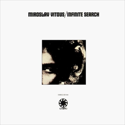
Not a very inspiring image, but it’s not uncommon for labels to release jazz or fusion albums with a simple photo of the artist, while patting themselves on their backs for a job well-done. In this case, it has the same flaw of Genesis’ In The Beginning with all that wasted space. However, I can actually appreciate the simplicity here. The black and white balance works nicely, and if you approach it from a collector’s perspective, this would be a great sleeve to get autographed.
Infinite Search was also released under the name Mountain In The Clouds. While the outside looks drastically different, they opted to use the same picture of Vitous within the inner sleeve.
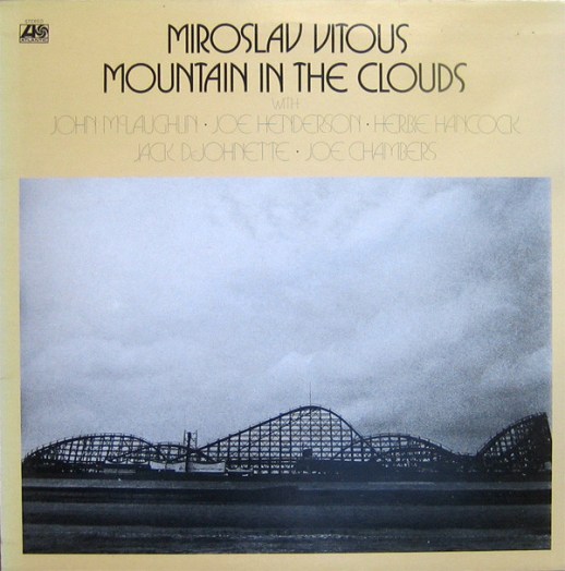
Conceptually, this vaguely matches the album’s title, with the cloud-saturated sky above the mountain-like peaks of roller coaster. However, would it have been all that difficult to locate a suitable picture of an actual mountain range? Then again, Vitous very well could have been inspired to pen the title track on an enlightening day at an amusement park. I’ve heard that Elvis Presley recorded ‘All Shook Up’ after a particularly thrilling ride on the Tilt-A-Whirl, so there may be some precedence (I didn’t actually here that).
An extra track, ‘Cérečka’, was included on this and many other reissues, including the version in my collection. The inclusion of the album’s lineup is a nice aid for potential listeners, bringing the cover more in line with what several jazz recordings made practice of in previous decades.
How about my copy? Well, you get elements of both the above designs, and at three dollars, I wasn’t going to be choosy over what the cover looked like.
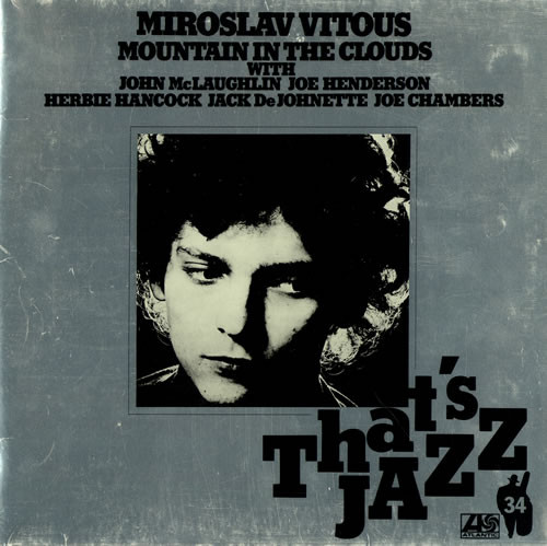
Silver would still have been hard on the eyes on a mint condition album, but these records seem highly prone to scuffing. This version is part of the That’s Jazz series that repackaged previously released albums, numbered as the 34th volume atop the silhouette of an upright bassist. Part of me likes seeing a consistent look in album covers that all came from the same record label. The goal may have been to get more jazz albums into public libraries like you would commonly see with classical records having uniform covering.
The track listing on this version was twisted around a little bit, but the title remained intact. The most amusing aspect of this pointless rearrangement is that they stick an ‘Epilogue’ as the third track. I find that more of an annoyance than anything. And, yet again, they pulled the picture of Vitous from the original release. Now that you see his entire face, he looks like he’s getting tired of the constant tampering of his first album as band leader. It’s as if nobody ever thought to ask poor Miroslav what he wanted.
Accept – Restless and Wild
It took this career-spanning video posted by Razorfist on Youtube for me to give a full Accept album a proper listen (he also convinced me to finally grab some Ramones as well as Alcatrazz). In case you haven’t heard them, I’d call their sound part Judas Priest and part AC/DC to give you some more mainstream points of reference. Restless and Wild was a breakthrough album for the German metal band in several European markets, though they are best known for their follow-up, Balls To The Wall.
Here’s the album cover in it’s original form.
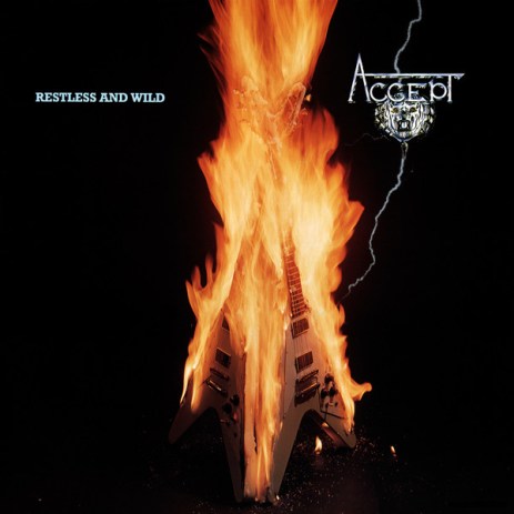
I’ve seen other groups using similar motifs of flaming guitars, but I don’t think the concept was completely played out in 1982. Heck, Yngwie Malmsteen was still a teenager, and the era of the shred guitarist had yet to fully evolve as a quasi-genre in hard rock and metal. There’s not much to argue with this one, except for the flames perhaps not looking as real as they could be. If I was in the band, I don’t think I’d want to risk burning one of those Flying Vs either, especially if the sales were underwhelming.
For one reason or another, most markets did not originally receive the above image. It was the 80s, so it was probably thought to have satanic overtones or it was seen as a bad influence for impressionable youths. Instead, most would see something that, while not as attention-grabbing, still makes for an iconic image in it’s own regard.
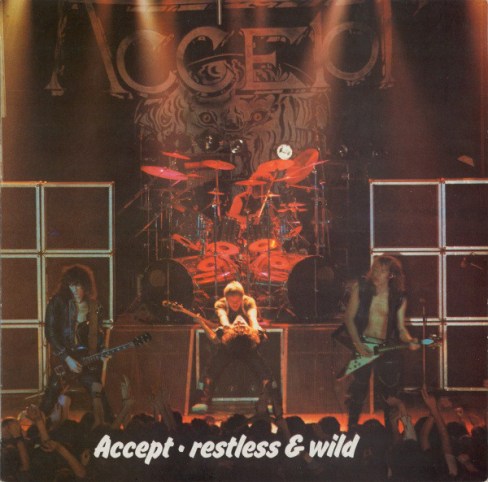
The main point of protest from me comes from the fact that any on-stage photography on a cover leads me to believe that the album is live. Granted, I do like the photo. I can’t quite tell what exactly vocalist Udo Dirkschneider is doing to bass guitarist Peter Baltes, but it almost looks as if he is strangling him. A highly inappropriate action for maintaining band harmony, but it sure makes for a great snapshot. Kind of a similar stage pose to that shown Scorpion’s Tokyo Tapes, and a mere guitar impalement away from matching the intensity of AC/DC’s If You Want Blood You’ve Got It.
Some copies feature the band’s logo captured in it’s natural position as the stage backdrop (which, in my opinion, makes it difficult to read), and some edition feature the band’s logo in different locations or the album title in a different font. My CD copy falls into the latter category.

I think this one looks much sharper, but the band’s name is listed needlessly above the logo. Was this in case you couldn’t read it? Come on, now! It’s not exactly Korgonthurus, is it?
Yes – Time and a Word
On the sophomore release by progressive rock legends Yes, they must have felt they needed to make a statement. Judging from the image below, it appears they sure gave it their damnedest.
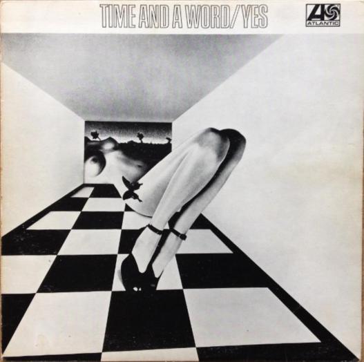
Is this a random frame from one of Terry Gilliam’s Monty Python’s Flying Circus animations? The result of an art student’s fever dream? Or is is it just an experiment in the theory that titties can sell anything? It’s not as if the music isn’t enticing enough already, as both of their first two albums easily fall into the underrated category of their otherwise much-analyzed discography. One day, I’ll need to re-watch their Classic Artists documentary to see if anybody can give this artwork a proper explanation.
What ever you make of the above cover (which featured only on UK editions initially), I’d take it any day of the week over either of the other two I’m about to show you.

What. A. Mess. Where to start…
The album title is difficult to read, for one. It would be much more legible if shifted down a few millimetres so that it fits right along the bottom edge of the structure, and I would also darken it to a navy blue.
Also, it is far too cluttered and busy-looking for my tastes. Did the photographer catch them in the middle of shopping for stage props for the upcoming tour? Their sour-puss expressions lead me to believe they didn’t quite find what they were after. I have to admit, though, that their V-formation is a winning formula. It sure got the Mighty Ducks out of a few jams.
I had been meaning to grab this record for years, and finally grabbed the edition below at a decent price.
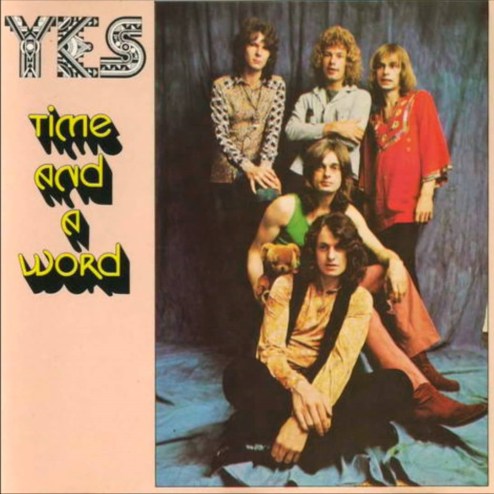
Any astute Yes fan can spot what’s wrong with this cover almost instantly. Steve Howe is shown on the cover. Steve Howe does not play on Time and a Word. He joined slightly after the album was released. His uneasy-looking glance off-camera may be giving us a hint about misgivings he’d have of his inclusion on a work he had no part in. The label were at least gracious enough to let the recording’s actual guitarist (Peter Banks) remain on the back cover. Some may think this cover was shoddy treatment for the departed Yes man, but at least things didn’t escalate to how the Osbourne camp handled Bob Daisley and Lee Kerslake.
Slayer – God Hates Us All
I have to squeeze this one onto the list for a couple of reasons. First of all, I’m super excited about finally getting the opportunity to see Slayer live this May on their ‘farewell tour’ (yet how many bands have broken that promise?). Second, this album represents my entry into Slayer fandom. For a teen at the time who was still very early in my Metal 101 lessons, I found this record to be a devastatingly heavy discovery. And that was all without even pressing ‘Play’ on the CD player.
This was a cover my brother and I would do our best to avoid leaving out in the open in fear our parents would see it. We went to Catholic school from kindergarten through Grade 12, and were fairly frequent church attendees at the time, yet my parents (to this day) don’t really seem all that religious. I don’t really know what we were dreading. They knew we were clever enough kids that had not, and would not, cause them much real trouble.
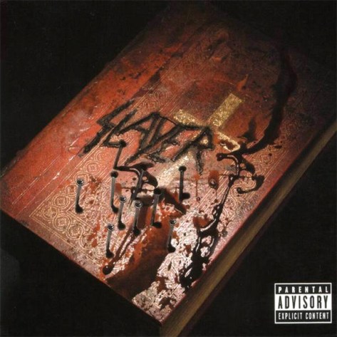
In retrospect, this seems like one of those covers that is trying a bit too hard to be rebellious or controversial. Guitarist Kerry King apparently wasn’t all that pleased with the final product either. I bought into the concept as a 16-year old, but now it’s an image that I could take or leave. The album’s title, which is a lyric in the song ‘Disciple’, conjures up a myriad of imagery ideas, be they the plagues of the Old Testament or more present-day examples of human suffering. Settling on something like this feels like a missed opportunity.
Of course, being one of those bands that never struggled to attract controversy, they needed a Walmart-friendly alternative to the blood-soaked Bible.
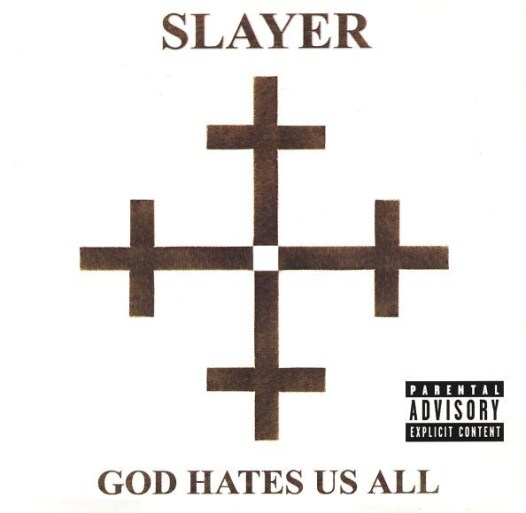
In some cases, it appears that this was used as a cardboard slipcase to go over top the existing cover. I’ve never seen it at the stores, but I do remember seeing versions of God Hates Us All that featured this cover placed on the booklet within the jewel case.
Leaving other potential concepts previously mentioned to the side, I think a combination between both of these covers would have worked the best. While it would defeat the purpose of the censorship, some red blood stains would have breathed a bit of life into this dull compromise. I guess this is similar to the original From Genesis To Revelation in that they were going for a realistic biblical look, but I think I’d still prefer there to be the recognizable Slayer logo on the top. On the other hand, Seasons In The Abyss didn’t need to list their name on the front, and it is considered one of their finest works.
Be on the look out for a third edition of this series if you’ve found these interesting. I may not write these blogs at the pace of other writers, but I’ll try not to pull a Chinese Democracy.

4 thoughts on “Alternate Album Cover Art II”